Methods
Our process, after determining which county we were going to analyze, was to collect the appropriate data for the variables determined in Project 2. We collected this data from the United States Census Bureau and standardized it so that each block group would be represented equally. Once we had performed these tasks we then, with the help of Dr. Lisa Keys-Mathews and Dr. Robertson, performed a factor analysis of our variables using SPSS software. After a process of trial and error, we eventually decided to run the process with ten components. The factor analysis essentially reduces redundancy in the data and combines related factors according to their relationship, whether that be positive or negative. As a result, we chose the three strongest components that we could recognize and created a series of cloropleth maps to label each block group according to its standing in each component. We tested some of our results using aerial imagery from Google Earth. For example, we compared areas of financial affluence and lack thereof on our maps with detailed imagery from Google Earth in order to determine the general accuracy of the factor analysis's groupings. Was financial affluence visible from the location, size, and environment of the housing?
The Factor Analysis
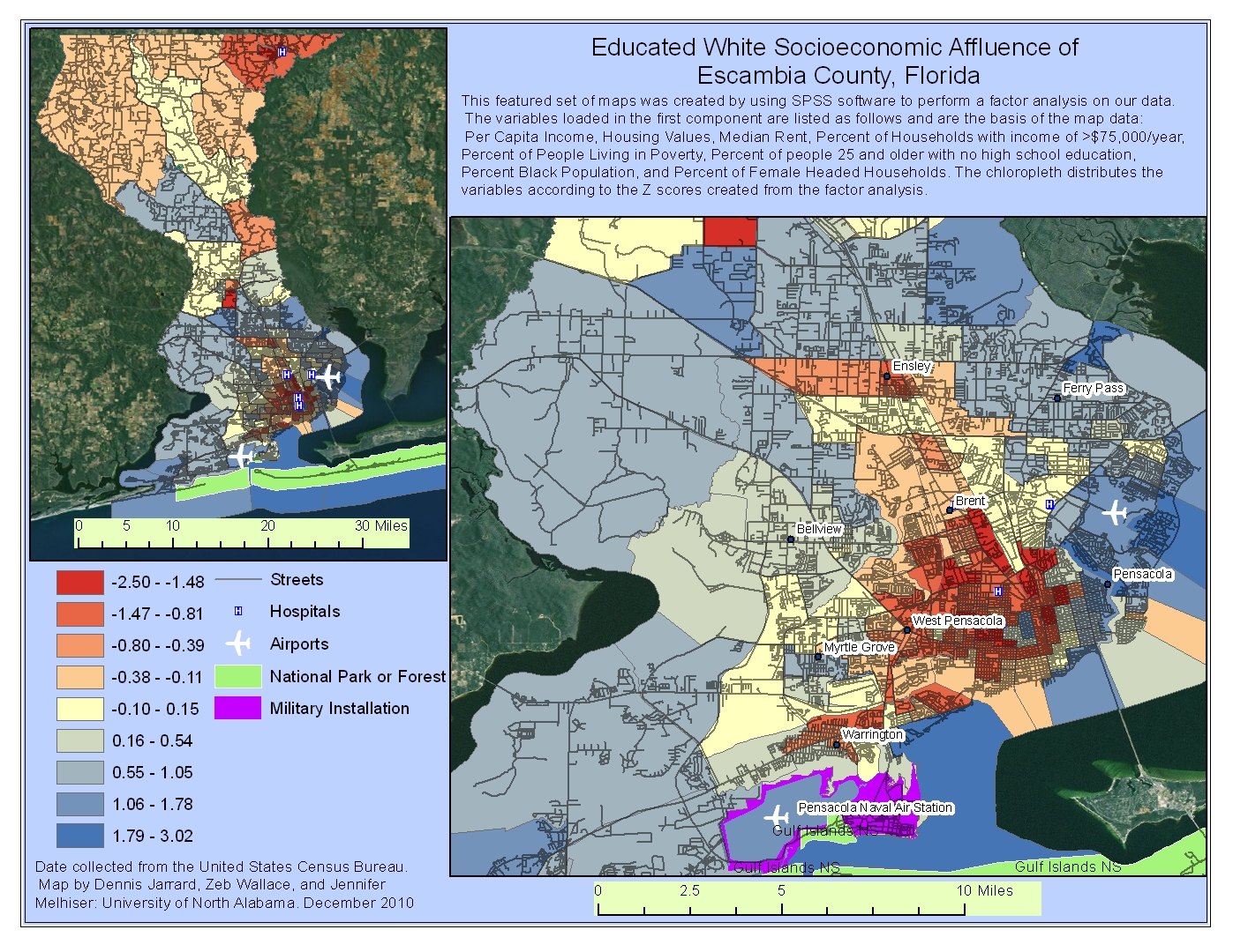
As previously mentioned, we selected the three strongest components in the factor analysis that we could recognize. We named the first factor "Educated White Socioeconomic Affluence" because of the variables that were loaded into the component. The following table represents the strongest variables that loaded and their relationship:
| Variable | Relationship |
|---|---|
| Per Capita Income | .882 |
| Housing Values | .824 |
| Median Rent | .772 |
| Percent of Households with income of >$75,000/year | .836 |
| Percent of People Living in Poverty | -.858 |
| Percent of people 25 and older with no high school education | -.863 |
| Percent Black Population | -.719 |
| Percent of Female Headed Households | -.741 |
To read the data, one only has to look at the numbers, as the positive values go up, the other positive values rise with it. However, as these values rise, the negative values decline and vise verce. For example, within the data in the previous table we can see that in Escambia County, as Per Capita Income goes up, Housing values go up, Median Rent goes up and the percentage of high-income families go up. However, as these factors rise, the percentage of people living under the poverty line go down (naturally), the percentage of adults living in the area with no high-school education goes down, the percentage of African Americans residing in the area goes down, and the percentage of female-headed households goes down. Therefore, we can then theorize that this particular component reveals white, educated, and affluent block groups within Escambia County.
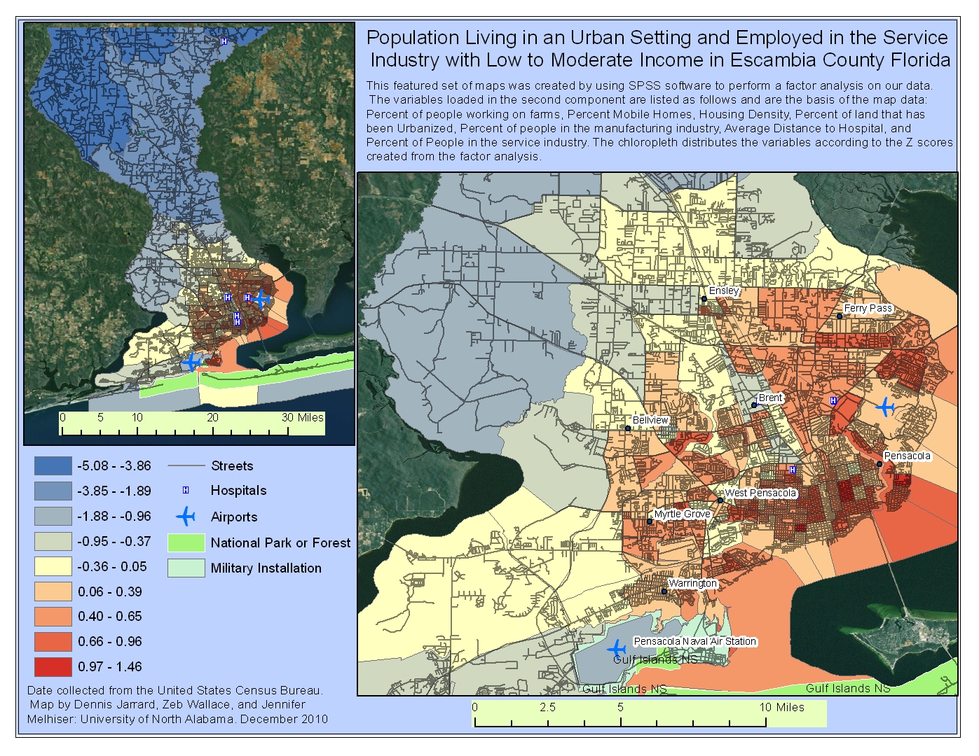
We then identified the second component as the Population Living in an Urban Setting and Employed in the Services Industry with Low to Moderate Income. Keep in mind that the higher the number ratings in the table, the stronger the relationship. We included a few lower loading variables, to show the general trend.
| Variable | Relationship |
|---|---|
| Percent of people working on farms | -.772 |
| Percent Mobile Homes | -.560 |
| Housing Density | .603 |
| Percent of land that has been Urbanized | .793 |
| Percent of people in the manufacturing industry | -.672 |
| Average Distance to Hospital | -.824 |
| Percent of People in the service industry | .595 |
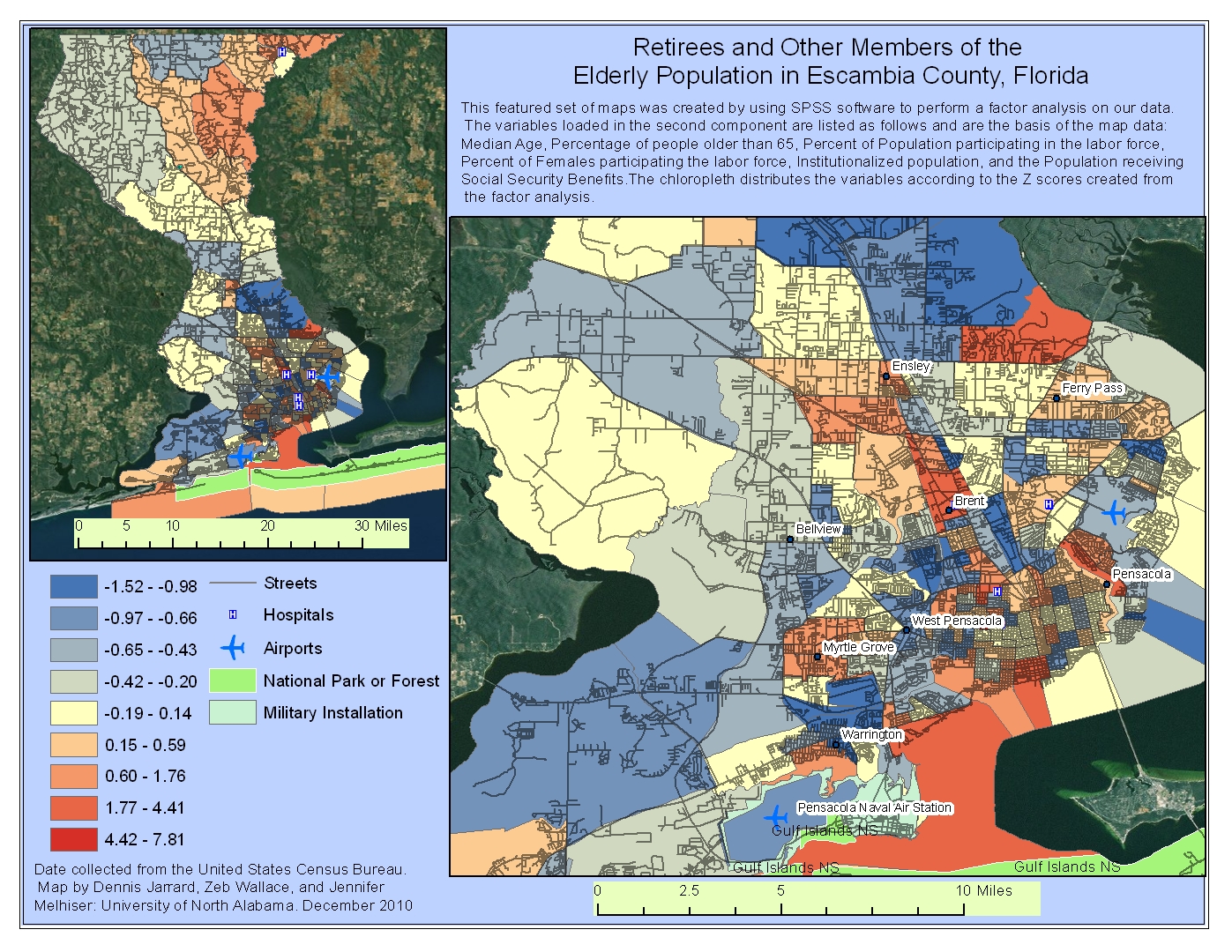
The third component that we selected seems to address retirees and other members of the elderly population.
| Variable | Relationship |
|---|---|
| Median Age | .675 |
| Percentage of people older than 65 | .856 |
| Percent of Population participating in the labor force | -.688 |
| Institutionalized population | .642 |
| Population receiving Social Security Benefits | .775 |
From this analysis we can conclude that in Escambia County the relationship between the number of people that are older than 65 and the number of people receiving social security benefits is very high, which is to be expected. There is also a positive relationship between these variables and a higher median age and percentage of people that are institutionalized (nursing homes, assisted living, etc.). These variables have a negative relationship with the percentage of the population participating in the labor force and the number of females participating in the labor force. Because of the components emphasis on the workforce, we tend to conclude that this component is addressing retired populations, but it does include other elderly populations as well.
Mapping the Components
After we had collected the data and performed the factor analysis, we then created three maps to demonstrate what our factor analysis revealed.
NOTE:Keep in mind that the each block group is color-coded according to its Z-Score. Imagine that 0 is the mean, and anything above 0 is above average and everything below zero is below average. For example, a z-score of 1.25 is equivalent to 1.25 standard deviations above the mean. Also, we used a color-scheme that portrays the more vulnerable side of the population as red. Not every map equates red with negative values as some variables actually reduce vulnerability.
On the first map (Map 1), the findings are rather logical. Much of the wealth in the area is concentrated around the coast while the dense inner city contains some the poorer areas.
Also, the area surrounding the Pensacola Naval Air Station is surrounded by some of the higher income in the county. This also makes sense due to the number of government employees and contractors that are connected the naval base. Interestingly, this map really resembles (with some irregularities, of course) the concentric zone model because the central business district is surrounded by some of the lowest income in the area, followed by a ring of medium levels of income, followed then by a ring of higher levels of income. According to this map and analysis, some of the most vulnerable people (financially) reside in the downtown area where dense housing and low income are most common. Though not as extreme as the dense urban areas, some of the larger, more sparsely populated block groups in the northern side of the county may also be fairly vulnerable. However, they are not as prone to a storm surge as downtown Pensacola. Though the wealthy are less vulnerable financially than the poor, they do tend to choose to reside closest to the coast, putting their homes at some of the highest risk. However, it is assumed that because of their ability to purchase such homes, they also have obtained flood insurance and have the ability to evacuate quickly if need be. Some of the inner city dwellers may not have the means to evacuate.Map 2 reveals some more information about the inner city and the levels of vulnerability present there.
This map essentially shows the populations that are employed in the service industry, generally making low to moderate income, and dwelling in dense urban areas. Though there are obviously some anomalies, this map reveals the vulnerable urban population. For example, the low-income areas discussed in the previous map are close to or are some of the same areas that have some employment vulnerabilities. Service industries tend to take a hit during a natural disaster while manufacturing and construction type jobs tend to do rather well. Obviously, the most vulnerable service industries are ones that don't pay as well. For example, a gas station or restaurant that is damaged is likely to temporary cut employment until there is some level restoration while high-tech industry jobs are more likely to stay open and continue functioning as they don't rely as much on the local population for income. As these areas tend to be opposite of the high-income areas which seem to have very little ethnic diversity, we can generally assume that some of these ethnic populations probably live in these dense urban areas. Minorities and ethnic groups tend to be more vulnerable in disaster situations because of their lack of social capital, both in the political realm, and in their range of social networks.Map 3 is meant to reveal some of the elderly, retired, and institutionalized populations.
These populations are generally quite vulnerable because of their lack of ability to evacuate. They also tend to be forgotten in emergency situations as they often don't have the ability to call for help. Interestingly, the southwestern part of the county, where we theorized that the area contained military personnel and government contracting personnel, there is some of the lowest concentration of elderly people in the entire county. This further confirms our assumption. Rather, some of the elderly are located downtown, which is to be expected simply because it is the oldest developed area. However, we also find a relatively large elderly population in the northwest part of the count. This could possibly be explained by the remnants of old farming communities that have suburbanized. Much of this area is also sparsely developed enough to be considered "the county", where a lot of retired people prefer to live, or have historically lived for decades.Verifying the Analysis using Aerial Imagery:
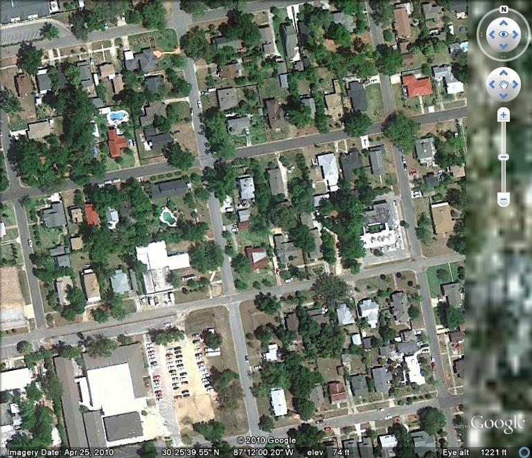
In order to test some of our assumptions, we decided to consult Google Earth imagery to analyze some of the areas that we theorized about. For example, did areas that appear wealthy on our chloropleth map have evidence in Google Earth imagery? Obviously, this is in no way an actual scientific process by which to establish theory. However, as this entire project was built from raw census data, we found it useful to make sure that our analysis was at least fairly accurate by aerial imagery standards. The first test was to determine if areas deemed "wealthy" by the index are visually wealthy. First, one of the wealthiest block groups portrayed on the map was selected.

Affluent Area

Impoverished Area
Densely Populated Area
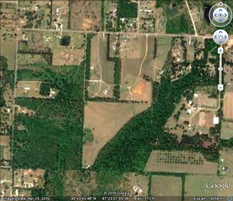
Sparsely Populated Area

